
Smart List DNN
Introduction
What is Smart List?
Smart List module is a powerful and flexible module which enables the creation of list type repetitive content in DNN. List created by Smart List are completely customizable which gives you the power of adding and editing the template design as you need, e.g. image slider, user profile list, image gallery, video gallery, simple html content, and testimonials etc. Moreover, it takes just few minutes to configure list with no programming and minimum html knowledge.
Why Smart List?
Smart List is the best solution for any list type content, using this module you can create your own repetitive type template with design and data and this module also gives the place to encapsulate the list content in a header template and much more.
Once any list template is configured, user just needs to add the content for the designed list template and this will add the content in the page module.
Getting Started
How to Install Smart List?
You have to download the latest version of Smart List from DNN store.
In order to install Smart List module on your DNN website, you can follow the steps below:
- Log in into your DNN site with host account.
- From the Host Menu option select Extensions.
- In the Extensions module menu, click on Install Extension Wizard button
- On the Upload New Extension Package page, click on Choose File button
- Select the Smart List package you previously downloaded on your hard drive, then click on Open.
- Click on Next, accept the license, continue through the install. If all goes well, you will get a list of messages with "EndJob Installation Successful" at the bottom. When all is finished, click on Return button.
And that's pretty much all about the installation, the next step is to activate the module from production or if you try a demo, you have to unlock the trial for 30 days.
How to Use Smart List?
Using this module you can create image slider, image gallery, testimonials etc. Now, we will see how we can use this module. The following are the steps to use it.
- Add module to your page.
- Add columns (tags) to module from settings.
- Create item template using the added tags.
- Create header template for the item template.
- Add content (data) to the created columns from Add Content Section.
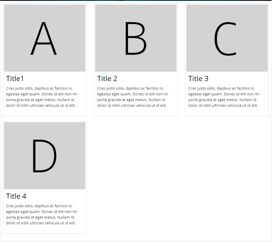
When done visit the view part and you can see that module is created. Let us go in details in the above steps.
In the steps below we will show you how to create testimonials section.
Add module to your page
From the page on which you are working, select the modules option from the bottom and click on the Add new Module option.
After that find ‘Smart List’ and with Drag & Drop option add the module to your page.
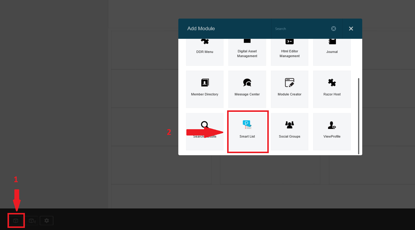
For old version of DNN, from the page on which you are working select the modules option from the top menu and click on the Add New Module option. Then find ‘Smart List’ and with Drag & Drop option add the module to your page.
Till now you have installed the Smart List module on your page, now you will need to configure it by adding columns (tags), template and content (data) in the module.
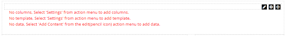
Below are the steps for adding columns, template and content in the module. In this example we will create testimonials on your page.
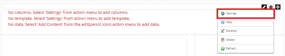
Add columns (tags) to module from settings
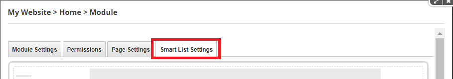
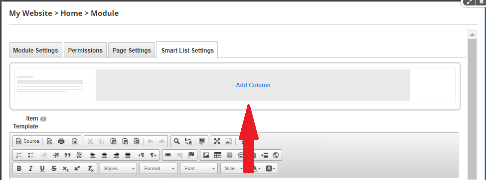
To add the columns in the module, click on the settings icon then click on settings. This will open the settings form where you can add the columns or tags.
From the opened tabs, select Smart List Settings tab.
After tab selection, now you need to add the columns (tags) in the module by clicking on Add Column.
As we are creating testimonials, for creating testimonials we need 3 columns (tags) image, title and description.
To add image tag, we will say Add Column a new page will be opened where you can enter name, tag, display order and select the type of editor. For image tag, I have selected File Upload type editor. See below
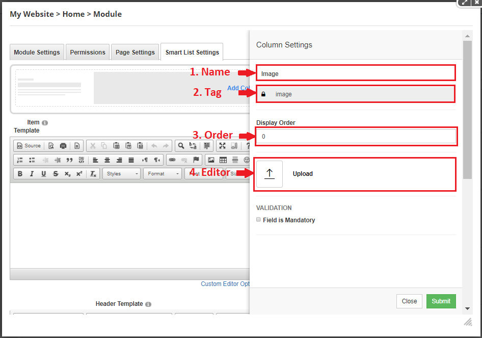
More details about the types of editors will look under the Columns & Editors section.
You may also be interested in Display Order, it is the order in which the columns are displayed in the Add Content Section we will look into this when adding content to the module.
In the same way create title column (tag) of editor type as Text String and description column of editor type as Text Area.
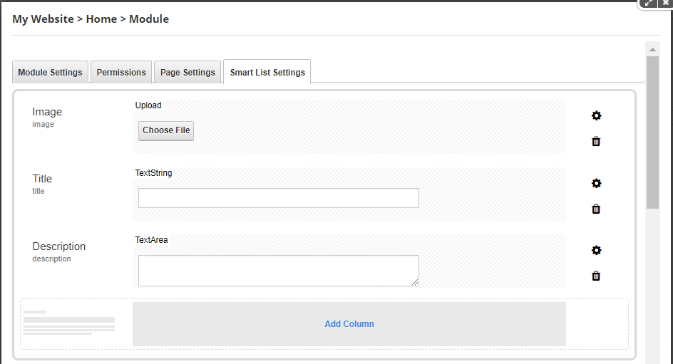
In this section, you can change the settings for your columns. It allows you to customize the columns and adjust various options such as editor, validation, etc. You can add, remove and reorder columns according to your needs. After you finish adding columns, we need to create item template using that columns or tags.
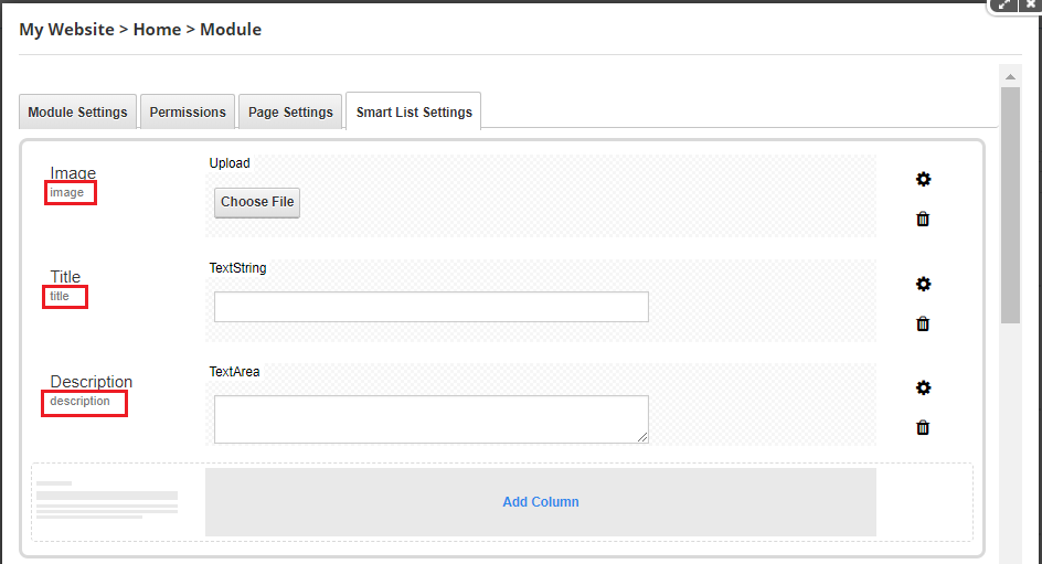
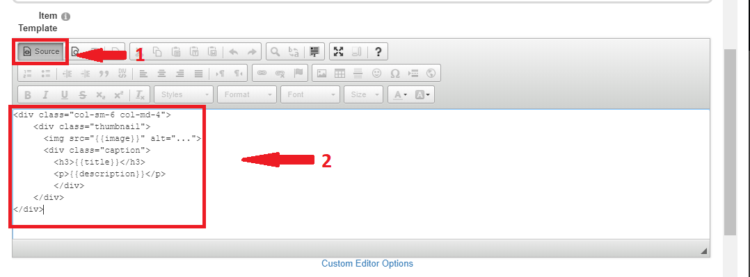
Create item template using the added tags.
Now, tags are created. So now we need to create item template using the tags or columns. Below highlighted are the tags.
We need to surround the tags in double flower brackets. For example, {{image}}, {{title}} and {{description}} are the tags we are using.
I have used the Bootstrap CSS library. So I used thumbnail component CSS classes to build the Testimonials. Below is the html template created by using the above tags.
- <div class="col-sm-6 col-md-4">
- <div class="thumbnail">
- <img src="{{image}}" alt="...">
- <div class="caption">
- <h3>{{title}}</h3>
- <p>{{description}}</p>
- </div>
- </div>
- </div>
Note :- I have used Bootstrap CSS classes to create template, you can use any CSS library and classes or can create your own CSS. It is just simple html template.
Place the above template in the item template section. See below
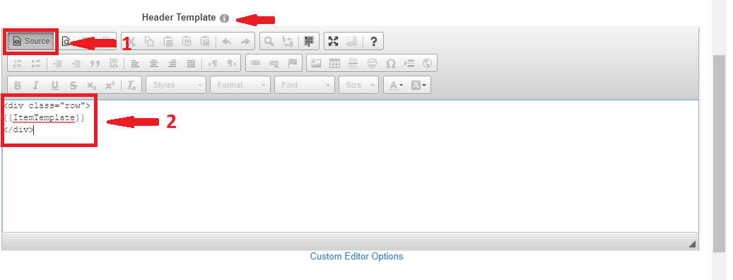
Create header template for the item template.
So, the item template is created. Now we need to add header template for the item template. So all the items created at runtime will be placed inside the header template.
Note:- You can skip adding header template if you don’t want to place the item template inside any header template.
To add the header template, we need to create html for that and place {{ItemTemplate}} tag inside the header template where you want to place all the created items. Again it is just simple html template.
Below is the header html template we are using.
- <div class="row">
- {{ItemTemplate}}
- </div>
Below the item template section there is header template section. Place the above template in the header template section. See below
Add content (data) to the created columns from Add Content Section.
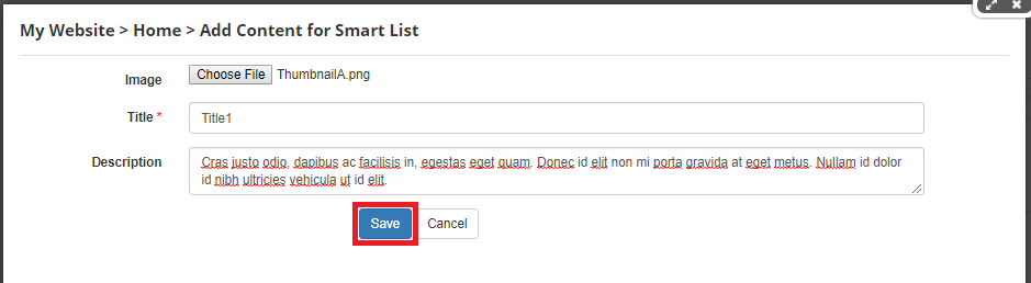
To add the content (data) in the module to the created item template, click on the edit icon then click on Add Content.
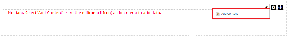
This will open the Add Content form where you can add the content for the item template.
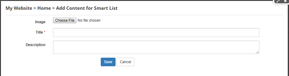
Now, fill the data in the above fields. As we have selected upload editor type for image, text string type for Title and Text area type of editor for Description, so it has displayed that editors. Upload image for image field, add title in the Title field, some description in the Description field and finally save the data. See below
In the same way, click on the edit icon then click on Add Content to add more data. I have added some more new data and saved it. See below
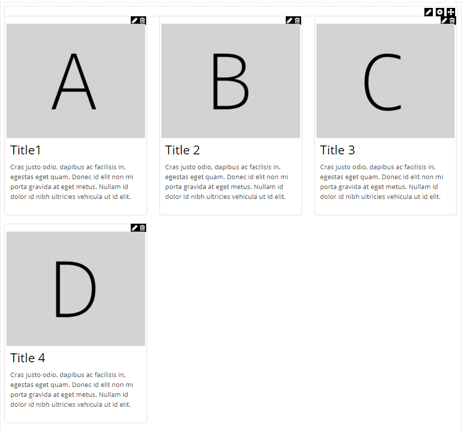
In the image above, at the top of the each item you can see edit and delete icon. So using this you can edit and delete the any content.
Below is the image how our testimonial is created in this tutorial.
Columns & Editors
Columns are the data fields you use to gather information when you add content in the module. They can be a variety of editors (Text String, Upload, Dropdown, etc.) with customizable properties and can be used in adding content. Editors are configured when you add columns.
You can also edit and remove the columns by clicking edit and delete icon at the right of each column.
The main configuration options for adding columns are Name, Tag and Editor Fields. Basically, the Name is the label of the column. Tag is the place holder in the template which is replaced when adding content. Editor is the list which specifies the input type required from the user, for example Text String, Text Area, Html Content, Check Box, Drop down values etc.
The main configuration is Selecting Editor. Following are the editors we are using in this module.
- TextString
- TextArea
- RichText
- Upload
- CheckBox
- DropDown
- Datepicker
Subscribe for a monthly roundup of best bits for Big Data and Azure.
Don't worry, we hate spam too, Promise. That's why we only send out monthly emails.
Sign up & get updates strainght to you inbox
Stay in the loop with our awesome newsletter. We'll send you monthly
updates of our latest and greatest tools and resources.